
Hi, I'm Christopher!
I design products that earn trust.
Product Designer specialising in AI-native UX and design systems. I've shipped a privacy-first AI platform that tripled adoption, and helped an award-winning design system go from static library to real-world standard. Helsinki-based, open to remote.

Working on Aalto Design System to drive adoption
Bridging the gap between design components and real-world product adoption.
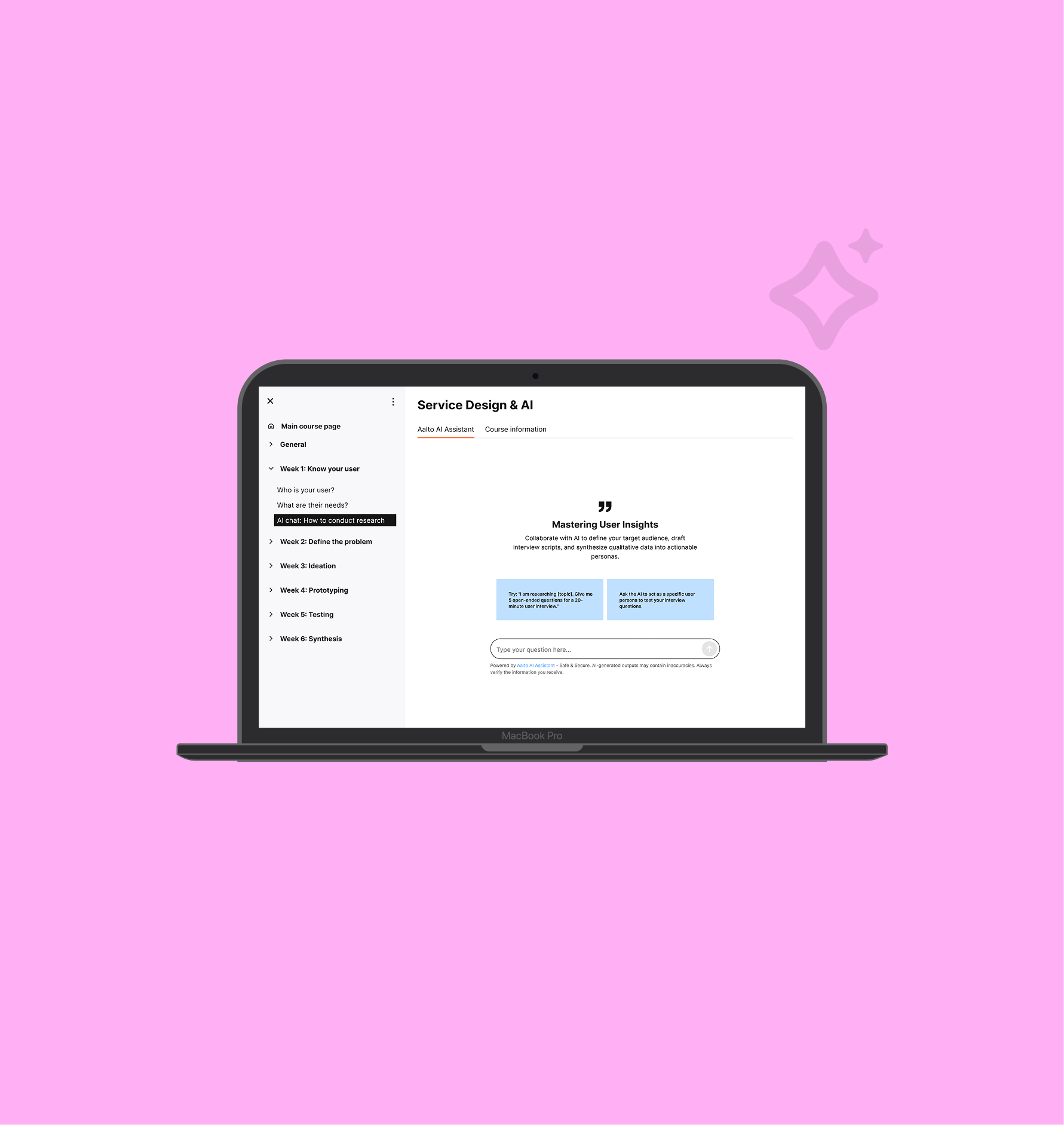
Aalto Secure AI Platform: Designing for privacy, accessibility, and scale
Designing a privacy-first AI platform that tripled student adoption
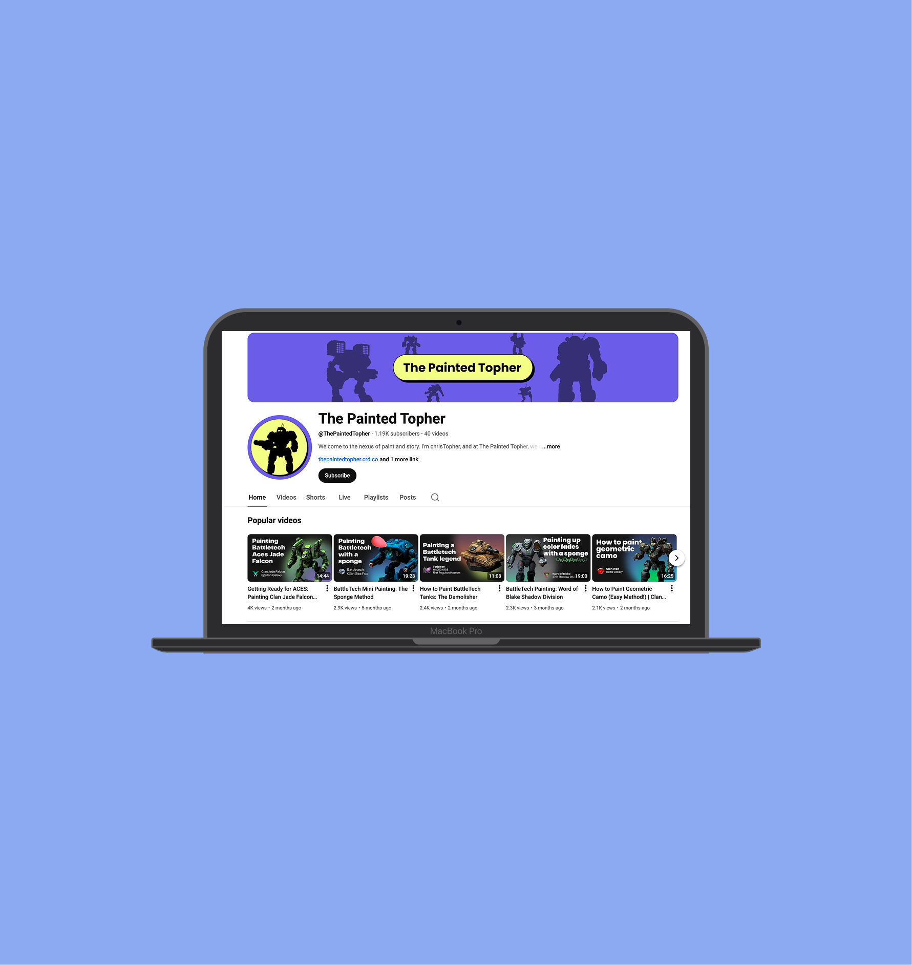
Youtube channel branding
Building an easy to use youtube brand with reusable UI designs
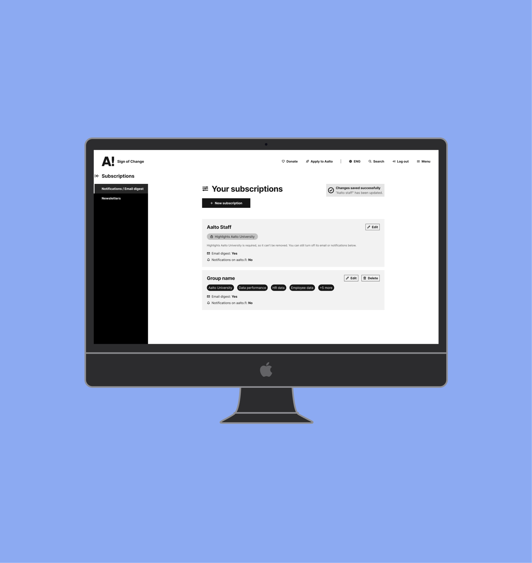
Subscriptions & Notifications
Letting Aalto's community choose what they hear from, and when

I’m Christopher, a Helsinki-based Product Designer. I don’t just design screens; I solve complex problems. I thrive on transforming ambiguous ideas into intuitive, accessible, and impactful user experiences.


How I got into UX
My background in psychology, along with teaching and management experience, laid the foundation for my transition to UX design. I was drawn to the field by a desire to understand user pain points in digital products and craft meaningful, intuitive solutions. My passion for service design thinking drives me to conduct research and interviews. Then, discovering insights that help create user-centered experiences.
Design System Development
I specialize in leading the design and implementation of enterprise-wide design systems, ensuring teams have access to beautiful, accessible, and consistent UI components.
Research & Data-Driven Insights
I don't just guess; I transform qualitative and quantitative user research into actionable strategies to drive continuous improvement for digital products.
Complex Problem Solving
Utilizing agile methodologies and service design, I manage the entire process from initial concept to final implementation, bridging the gap between business goals and human needs.
End-to-End UI/UX Design
I thrive on transforming user needs and complex business problems into intuitive, user-friendly service paths and high-fidelity UIs.
Stakeholder Alignment & Strategy
I collaborate closely with stakeholders, product owners, and developers to clearly justify design choices and align everyone on a strategic product roadmap.
AI-Driven Workflow Innovation
I actively leverage advanced AI tools and prompt engineering to develop effective working methods that accelerate production and elevate the quality of visual content.
Aalto University (2024-2026)
Designed UX for Aalto's AI Assistant — a conversational interface for 16,000 students and staff. Validated through usability testing with 50 participants.
Maintained and scaled a design system across digital touchpoints, ensuring WCAG 2.0 AA compliance across UI components
Facilitated cross-functional design sprints with IT, product, and academic stakeholders while translating research into prioritized product decisions
BDI (2021-2024)
Built a Figma-based component system and translated it into reusable WordPress templates for event microsites, unifying design across LinkedIn-driven outreach campaigns
Led end-to-end UX for event microsite products: stakeholder interviews, wireframes, and Figma prototypes, working within a small team without dedicated dev tooling
Delivered consistent, accessible UI patterns across digital touchpoints despite limited resources, keeping design quality high under real constraints

Aalto Secure AI Platform
Designing for privacy, accessibility, and scale
Responsibilities
UX research
Accessibility and User Testing
UI Design
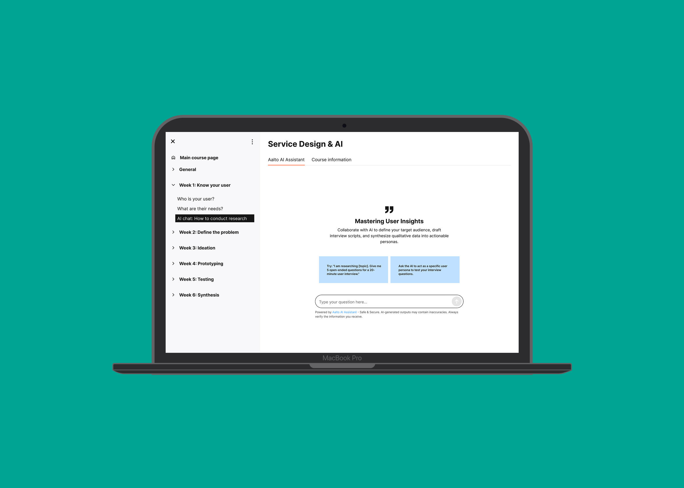
Project Summary: Scaling Safe AI in Education
As the lead UX/UI Designer, I led the end-to-end design of Aalto University's accessible, privacy-first AI platform. Collaborating closely with researchers and developers, I owned the user flows, accessibility testing, and UI design to create a secure alternative to public tools like ChatGPT, ensuring sensitive university data remains protected.To drive real-world usage, I designed a specialized Student Course Chat integrated directly into the university's Moodle interface. This feature empowers professors to securely train a localized LLM exclusively on their course materials, providing a safe, closed-loop learning environment that successfully tripled student adoption of our internal AI tool.
The Problem: GDPR Risks and a Breakdown in Trust
When generative AI exploded, University's faced a privacy challenge. Students routinely used proprietary, teacher-created course materials and uploaded them to public LLMs.Through my user interviews and stakeholder surveys, I uncovered three major pain points driving the need for an internal solution:
Severe Compliance Risks: The unauthorized uploading of university data to public models created massive GDPR and privacy liabilities.
Teacher Reluctance: Professors were so afraid of their intellectual property and course videos being leaked that many admitted they wanted to stop uploading digital materials altogether.
The Need for a "Safe Sandbox": The university knew banning AI was impossible. Instead, stakeholders needed a secure, closed-loop system integrated directly into the courses. Teachers needed the ability to safely train the AI on their own materials.
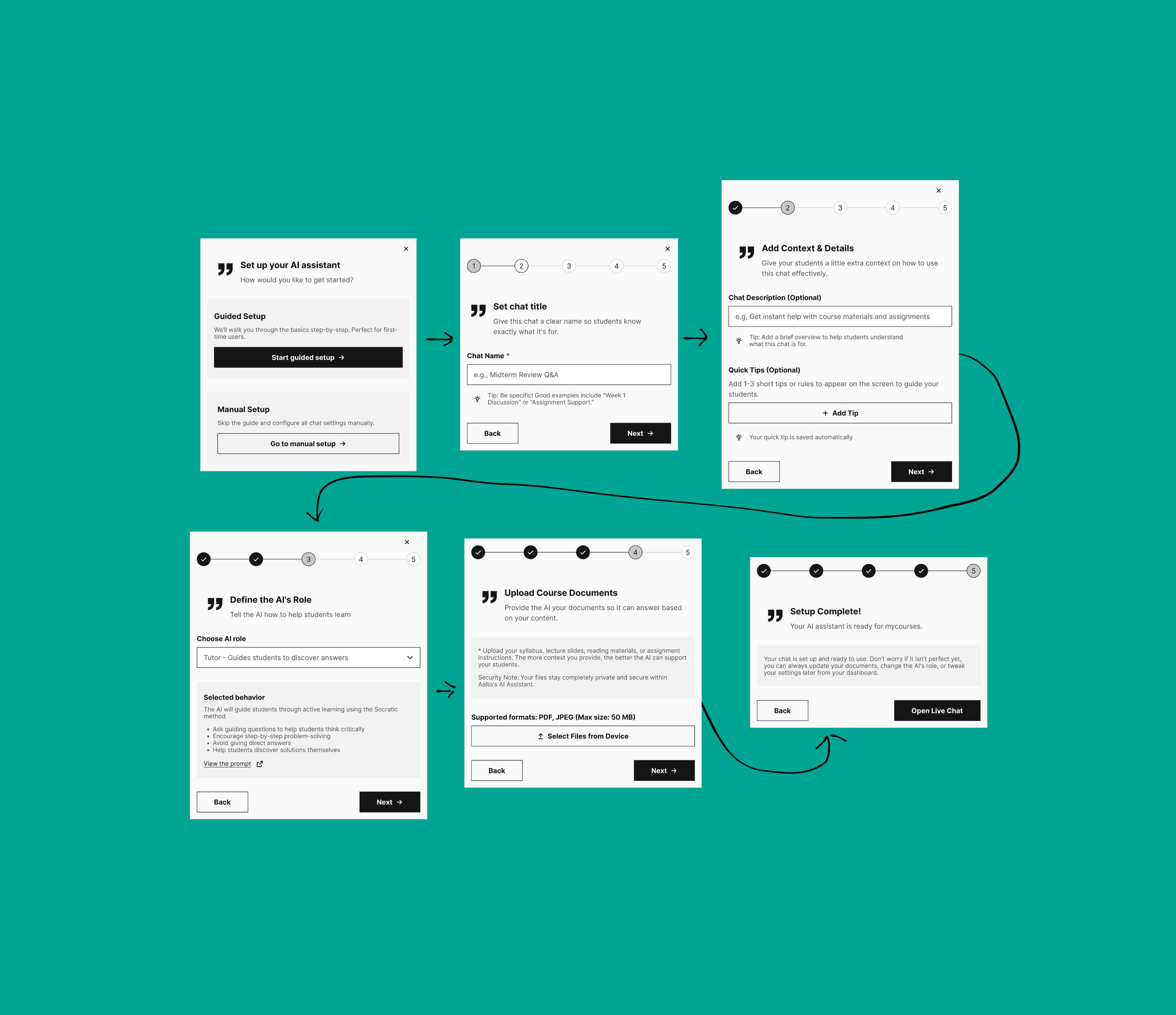
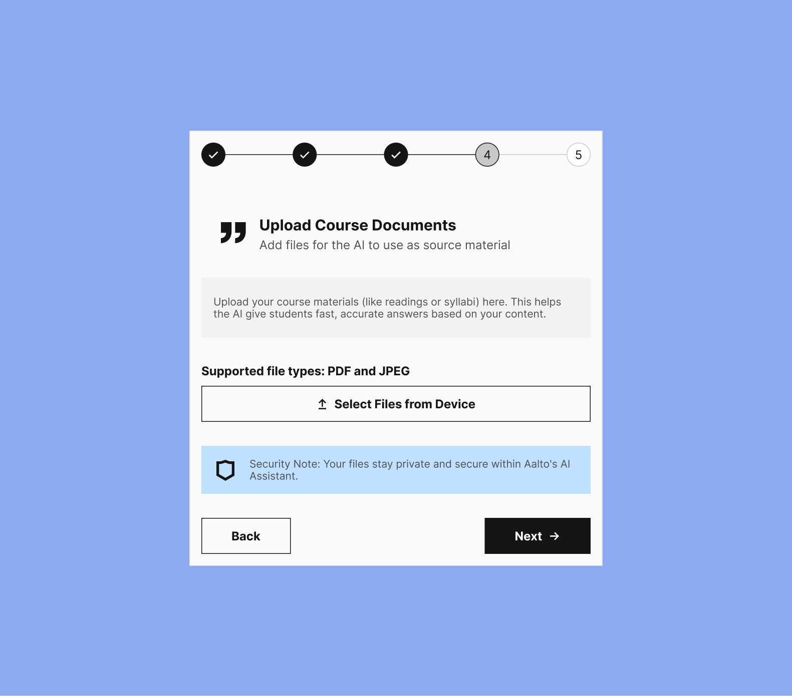
Role & Strategy: Designing an Intuitive Setup for Educators
Intuitive Teacher Setup: While the student experience was important, my research revealed that the true bottleneck was the setup process. I prioritized the educator's user journey, designing a chatbot creation flow simple enough for non-technical staff (like language professors) to use without friction.
Pragmatic MVP Delivery: Collaborating with developers, we deployed an iframe-based Moodle plugin. This MVP approach balanced technical constraints with the need for rapid deployment.
AI-Driven Live Prototyping: I leveraged AI tools to turn my Figma designs into fully interactive prototypes. This enabled me to test and iterate UI changes with teachers in real-time during user interviews.
Results & Impact: Driving Secure AI Adoption
Creating a Gateway to Safety: By integrating the chat into Moodle, we created a natural entry point. Students and staff are now actively navigating away from public LLMs and adopting the main Aalto Secure AI Assistant, thereby fulfilling the university's primary security goal.
Restoring Educator Confidence: Researchers and teachers who were previously aware of the AI tool but hesitant to use it are now excited to engage with it. They finally have a secure, controlled environment in which to use AI for student learning without risking their intellectual property.
Next Steps: A Holistic Academic Assistant
Moving forward, we plan to expand the AI chat's capabilities beyond individual courses to serve as a comprehensive academic assistant. The next phase will integrate the secure LLM directly with students' overarching study plans, helping them seamlessly manage weekly tasks, choose future classes, and map out their entire degree journey.

Working on Aalto Design System to drive adoption
Bridging the gap between design components and real-world product adoption
Responsibilities
Product owner
Component building
Documentation
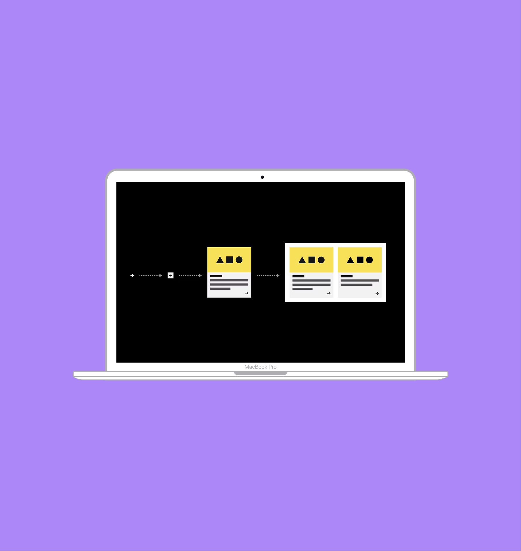
Championing the Aalto Design System to drive adoption, speed, and cost savings.
I joined the Aalto Design System as a hybrid Product Owner and UX Designer to transform a foundational component library into an actively used product standard. My role blended hands-on component design with relentless advocacy, ensuring the system was embraced by internal staff, Aalto startups, and external agencies.To remove friction and make the system truly approachable, I built ready-to-use templates that empowered teams to build on-brand digital touchpoints faster and cheaper. Ultimately, bridging the gap between design and real-world application drove massive adoption across the organization and contributed to the system winning a Red Dot Award in Europe.
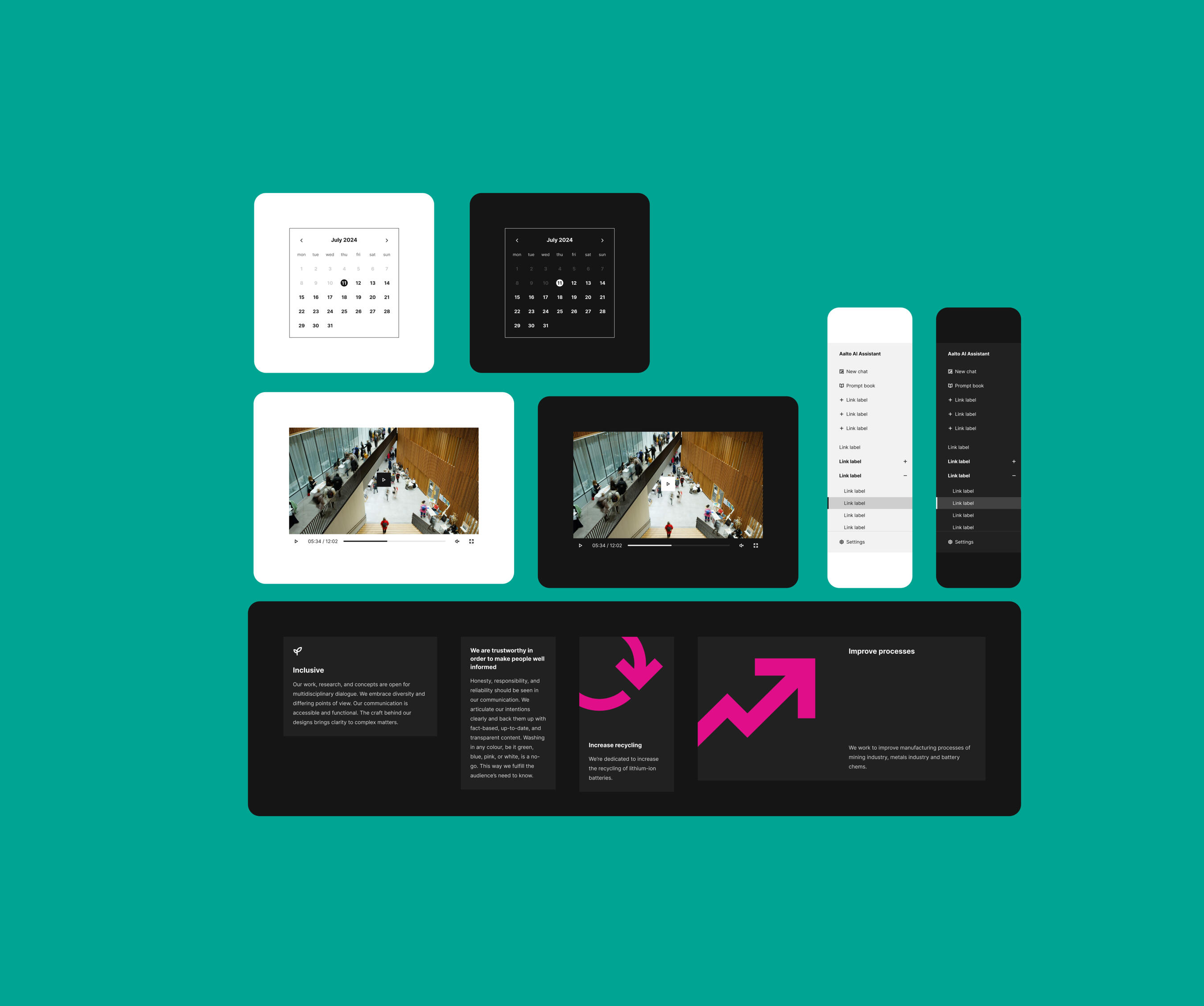
The Problem: Stakeholder needs and design system awareness
When I joined the team, the Aalto Design System was roughly 75% complete. While a solid foundation existed, my hands-on collaboration with stakeholders on their active projects revealed critical gaps. The system was missing components (such as custom date pickers and collapsible data cards) and the ready-made templates required for real-world application.This gap between a static library and a usable system created two major bottlenecks:
Brand Disconnect: Across thousands of Aalto digital pages, teams and startups were forced to improvise their own layouts, resulting in a fragmented and disjointed user experience.
Wasted Budget: External agencies and internal researchers were spending time and money designing assets from scratch because they didn't have plug-and-play templates to work from.
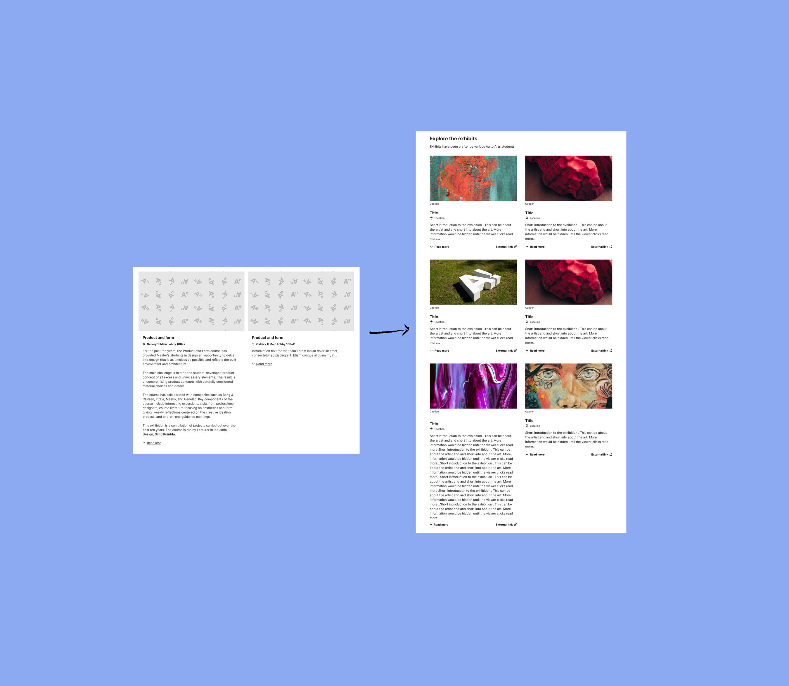
Role & Strategy: Designing with the Stakeholders
Cross-Functional Collaboration: I worked across a wide matrix of teams, collaborating directly with Aalto startups, internal project sponsors, and external agency partners. I also partnered closely with a mobile developer to design the mobile UI.
Discovery & Prioritization: Rather than guessing what components were missing, I treated the stakeholders as my users. I conducted targeted interviews across various Aalto organizations to uncover their exact bottlenecks. I then worked with the core DS design and development team to organize these insights, using Jira and Trello to prioritize Aalto's roadmap.
Systematic Execution: Once we identified the highest-priority needs, I built the missing, complex elements natively in Figma. I utilized advanced component properties while strictly adhering to the system's existing structural foundation to ensure seamless integration.
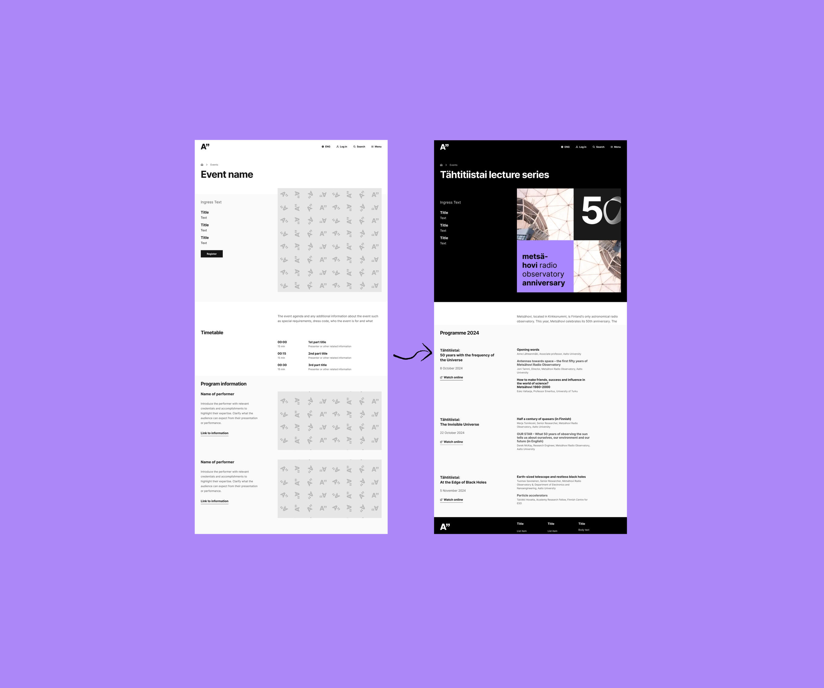
Results & Impact: Unifying the Brand and Driving Adoption
Widespread Adoption: By providing ready-to-use templates and filling critical component gaps, I drastically lowered the barrier to entry. This directly led to a massive surge in design system adoption across Aalto.fi and various stakeholder projects.
A Cohesive Digital Experience The thousands of previously fragmented pages and third-party builds are finally aligning into a unified, consistent digital brand for the university.
Operationalizing an Award-Winning System: While the foundational visual language of the Aalto DS earned a prestigious Red Dot Award, my core contribution was ensuring that world-class design didn't just sit in a static Figma file. I bridged the gap, ensuring those award-winning components were actually deployed into active, real-world products.
Next Steps: Education and AI Integration
Pushing Boundaries with AI: I am currently testing the limits of the Aalto DS by applying its components to design a new AI interface, exploring how the established system scales to support advanced, conversational UI patterns.
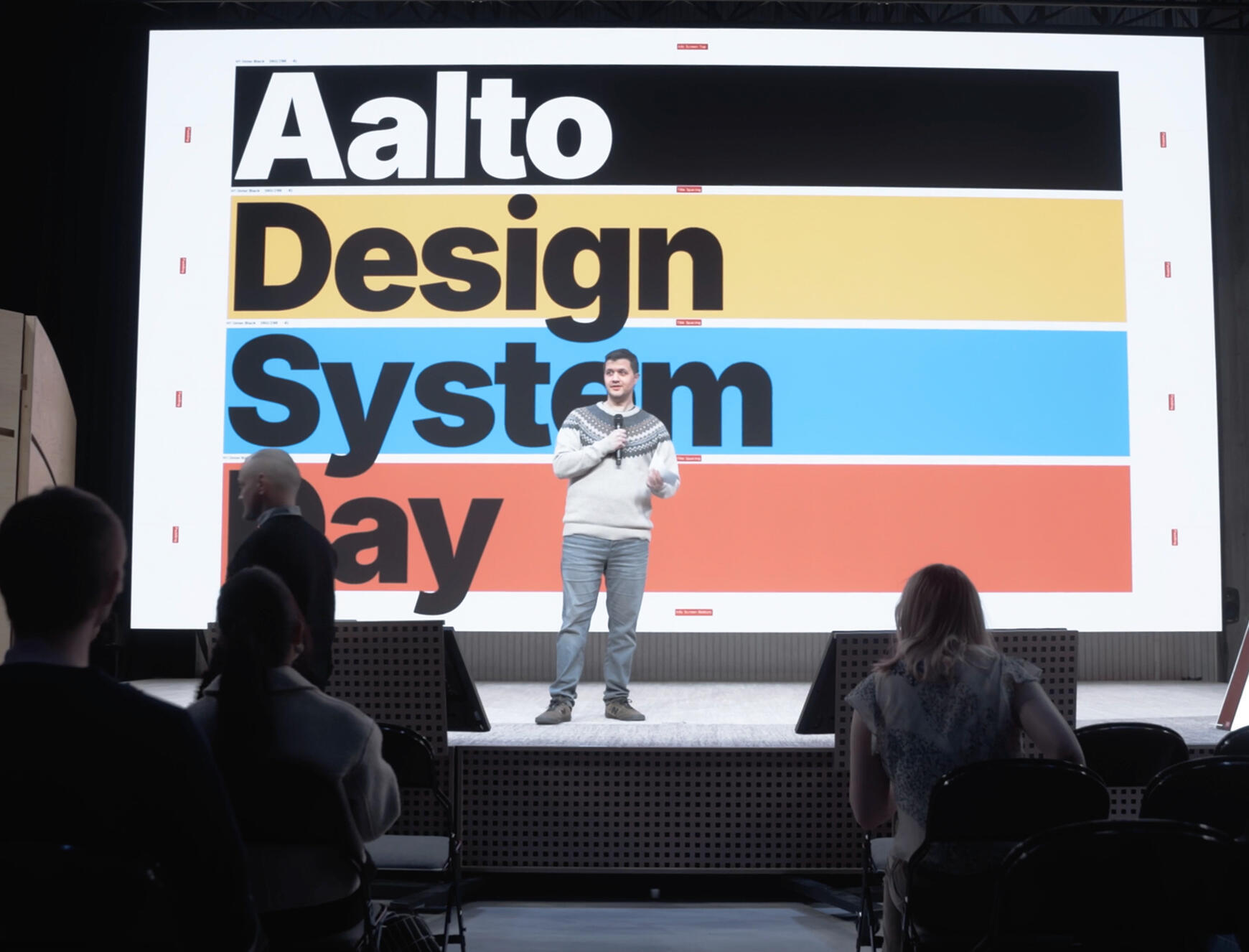

Branding for personal youtube project
Elevating 'The Painted Topher' with a cohesive visual design system to drive brand recognition across YouTube, social media, and web.
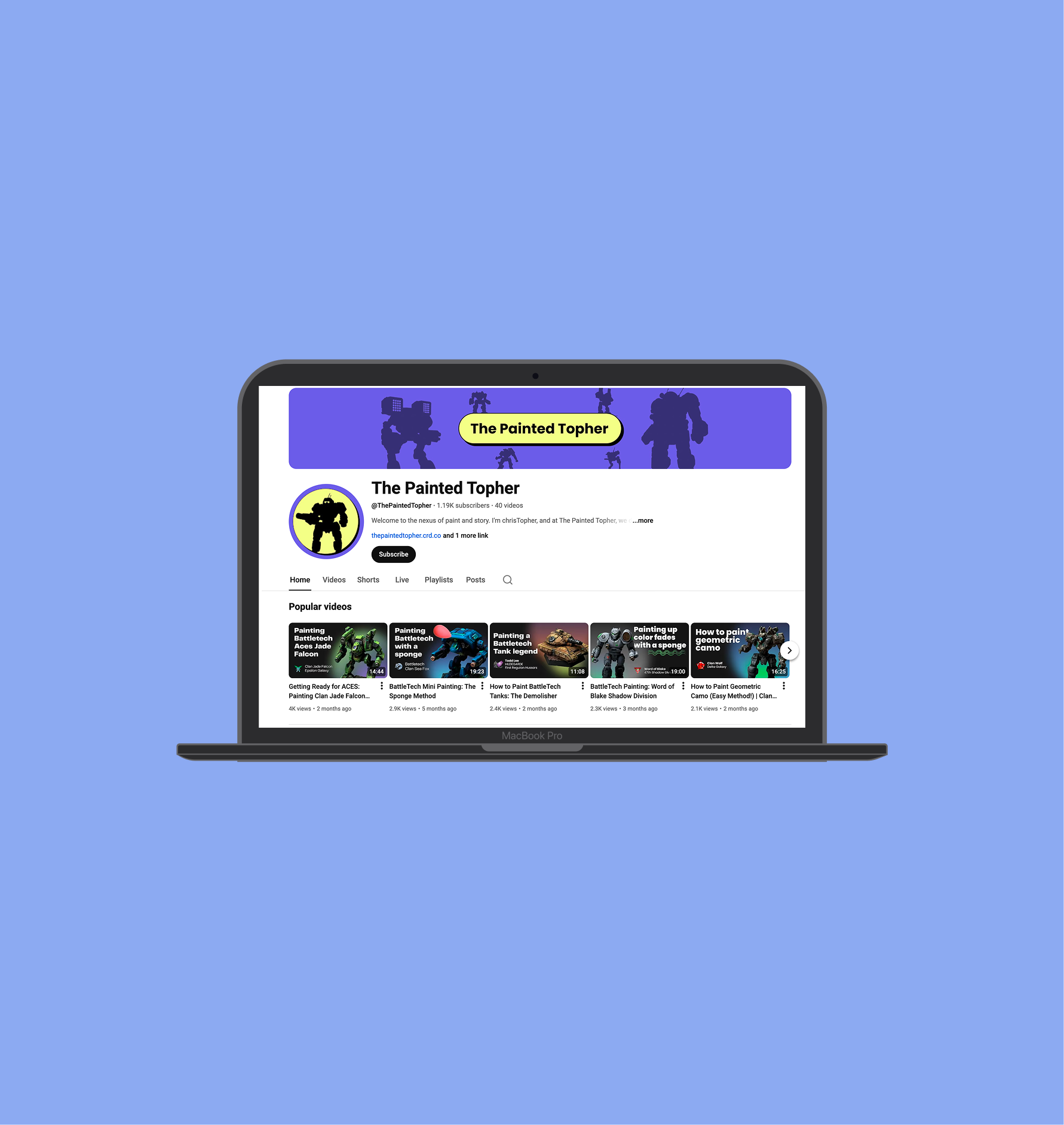
The mission: breaking away from the ordinary
To support the miniature painting community by removing the stress and intimidation of the hobby. By applying core UX principles to understand painter pain points, the goal was to design an approachable brand and video format that proves painting is accessible to anyone.
The goal was to make a consistent, bold brand in all touchpoints
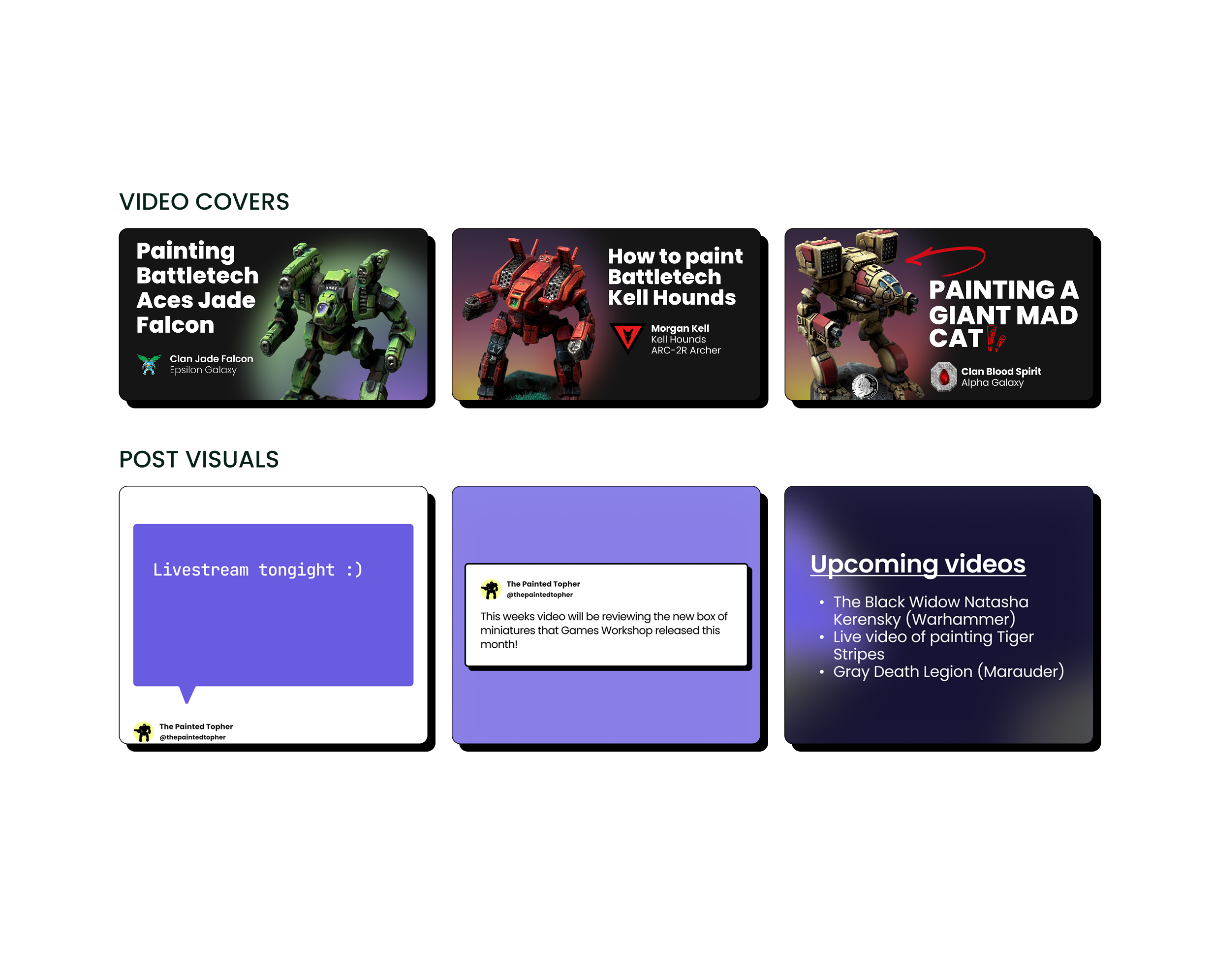
To cut through a highly saturated YouTube market, I developed a clean, bold, and consistent visual standard. This cohesive design system was applied across all touchpoints. From channel art and social media to in-video edits, graphics, and subtitles, we ensured the educational content was effortless to follow.Established immediate viewer trust and professional credibility, resulting in 1,300 new subscribers and full channel monetization within the first three months.
The Challenge: Standing Out in a Saturated & Intimidating Niche
The Market Saturation: The miniature painting space on YouTube is incredibly crowded. With countless creators fighting for attention, a generic or amateur aesthetic means a channel will instantly get lost in the feed.Many existing tutorials suffer from high cognitive load. Between chaotic thumbnails, inconsistent typography, and cluttered in-video edits, the content often makes the hobby feel stressful and deeply intimidating to beginners.Viewers judge the difficulty of the content by the quality of the design. If the branding looks complicated or messy, potential subscribers will simply scroll past, assuming the painting process will be just as frustrating. The brand needed to visually promise a stress-free, accessible experience before the user even clicked "play."
Designing for Clarity: Building a bold, approachable brand
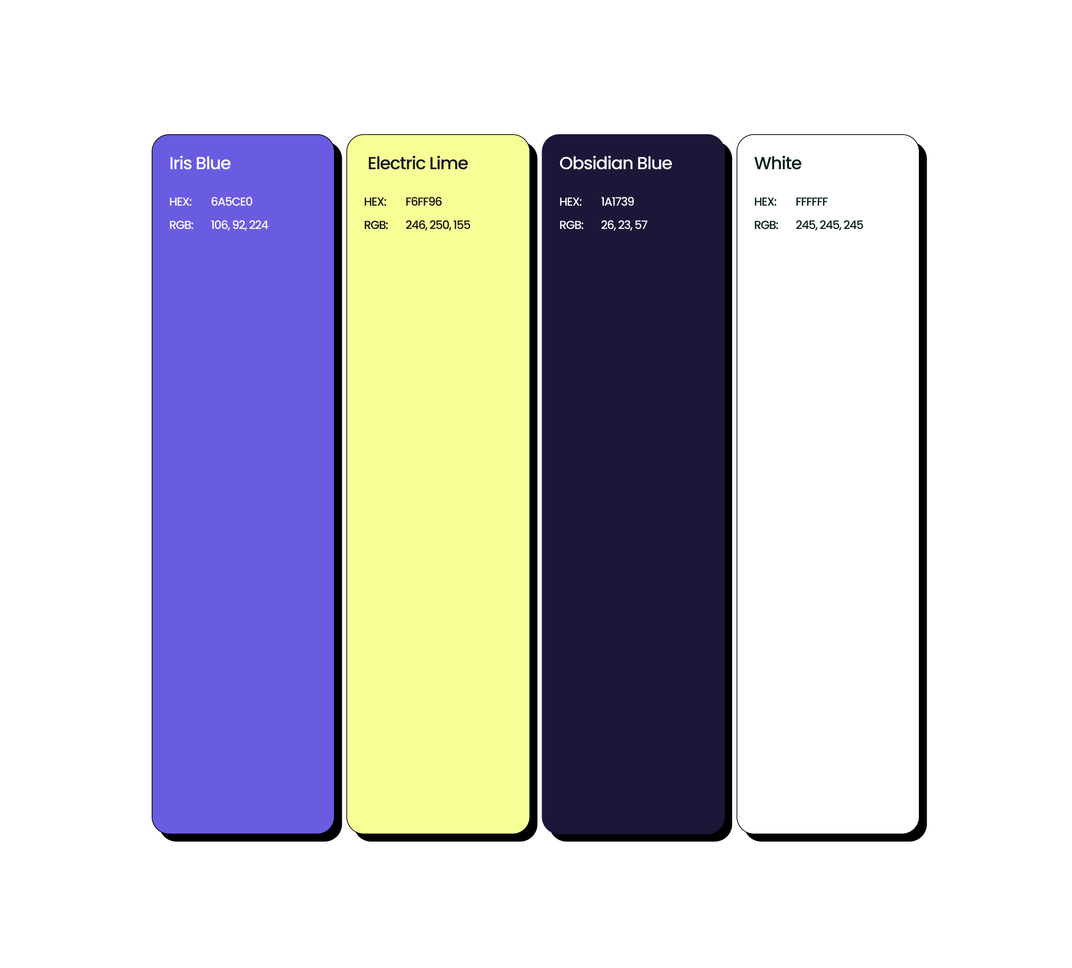
To cut through the noise of a crowded (and typically dark-mode) YouTube feed, I started by building a high-contrast color system. I grounded the brand in a deep Obsidian Blue, but injected high energy with vibrant pops of Electric Lime and Iris Blue. This wasn't just for aesthetics; it was a deliberate accessibility choice to ensure thumbnails would instantly grab attention as viewers scrolled.
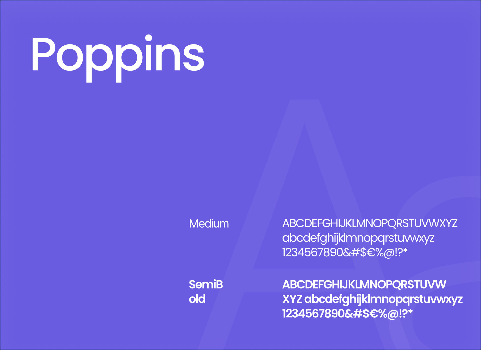
Next came the challenge of scale. YouTube assets live everywhere from tiny mobile feeds to full-screen video edits. I anchored the brand’s typography in Poppins, a modern geometric sans-serif that maintains exceptional legibility whether it's anchoring a channel banner or flashing on-screen as fast-moving subtitles.But a brand is only as good as its execution, and I knew that I needed to focus on painting, not pushing pixels every week. So, I translated these visual choices into a scalable, plug-and-play asset library. Utilizing distinctive, flexible mech silhouettes for the logo system, I built out standardized templates for video covers and social posts.
Next Steps: Scaling & AI Integration
Audience Growth: I am continuing to scale the channel and grow the community as a dedicated side business, using ongoing viewer metrics to refine the content.
Building a Product: Beyond YouTube, I am taking the learnings from this brand and developing a dedicated community application for hobbyists. I am currently experimenting with AI integration and using Claude Code to build out this platform, bridging the gap between a visual brand and a fully interactive digital product.

Subscriptions & Notifications
Solving a five-year-old newsletter problem at Aalto University
Responsibilities
UX research
UI Design
Usability testing
Summary
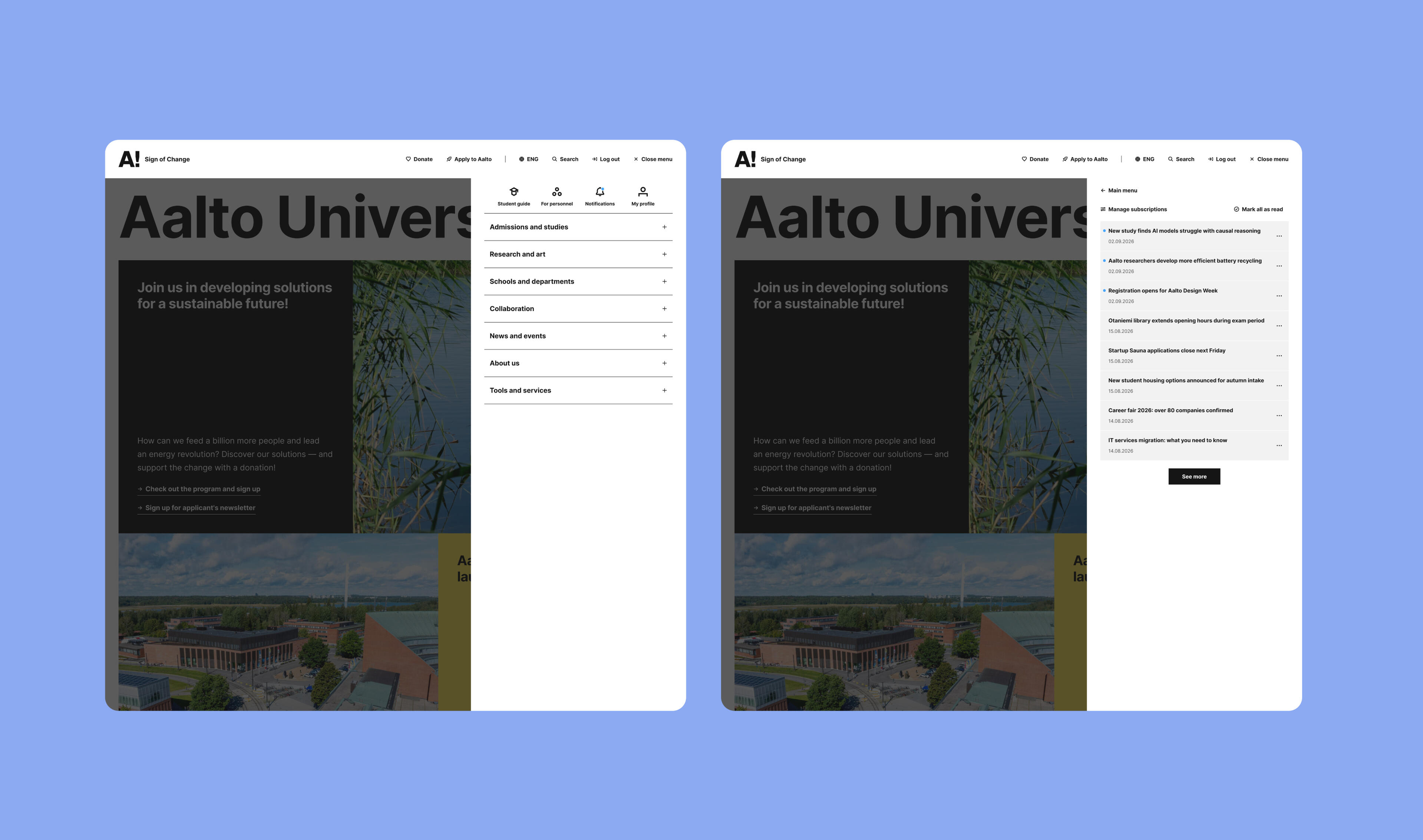
Aalto students, Staff, and prospective students were drowning in fragmented newsletters split across two platforms mid-migration, with no way to control what they received or when. I led research, design, and testing on a self-serve subscription system that lets users choose their own topics and delivery timing, a problem Aalto had wanted to solve for five years. It is now heading into launch and will be live in the year 2026.
Problem
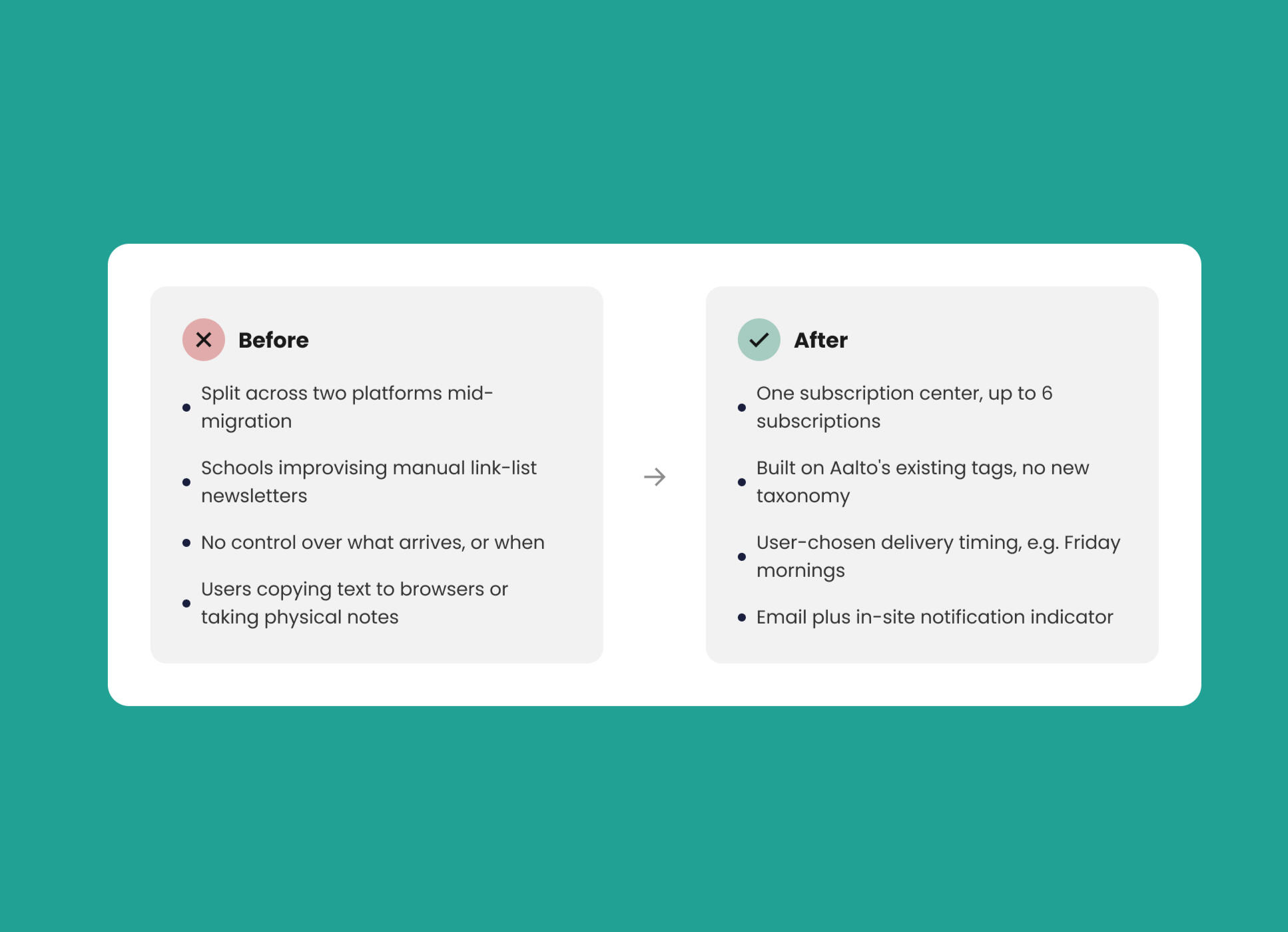
The trouble started upstream of any design decision: Aalto was mid-migration from Microsoft to Salesforce Marketing Cloud, a necessary, security-driven platform shift, but one that left newsletters scattered across two systems with no single source of truth. Individual schools filled the gap the only way they could; they were building their own manually curated "link list" newsletters, which only fragmented attention further. Some of these got read. Most didn't.What surprised me most was how far people had gone to cope. In interviews, I heard about people forwarding newsletter content to their own browsers just to save it somewhere findable, and others keeping physical notes because there was no digital way to relocate information once it had scrolled past. Staff and teachers, managing even heavier newsletter volume than students, felt it hardest. This wasn't a new complaint; it had been a known, unsolved problem at Aalto for five years.
Role & Strategy
I led the research and design end-to-end, working closely with the team's data analyst, IT, product owners, the team lead, and developers. Research spanned fifteen student interviews, five staff interviews, and five teacher interviews, backed by click-through data pulled directly with IT to see not just what people said, but what they actually opened. Rather than trying to solve everything at once, we scoped the project in two phases: students and staff first, prospective students later.
Approach
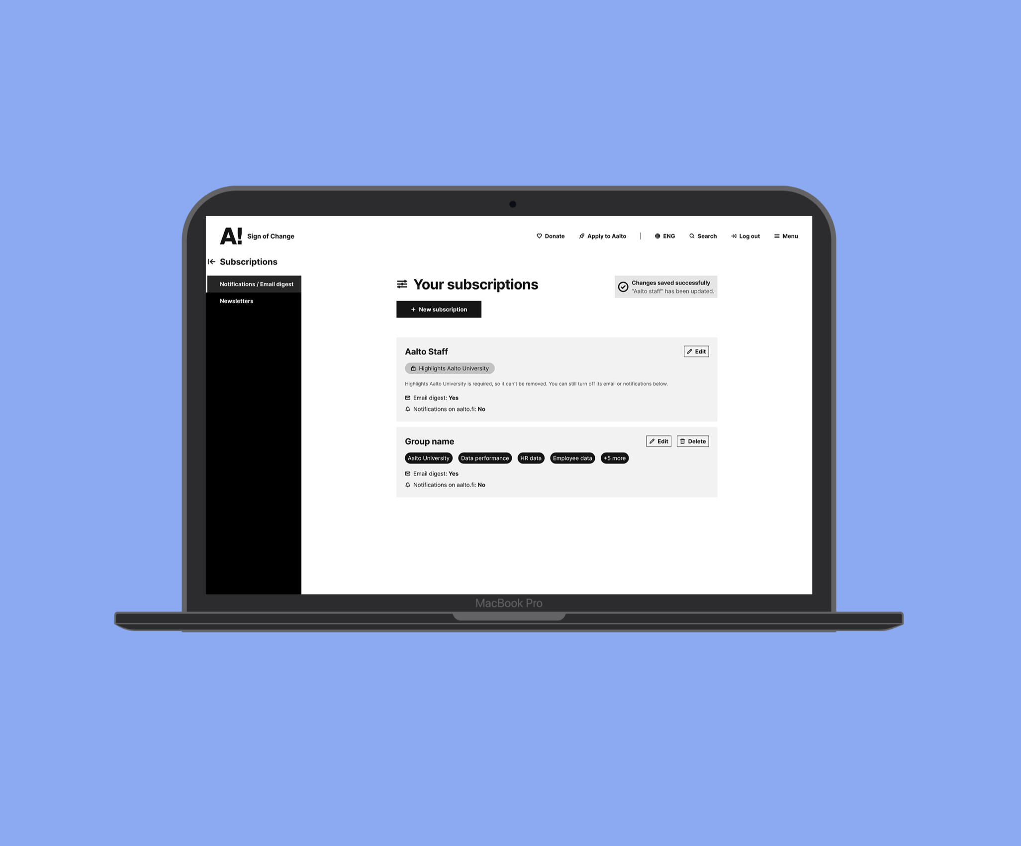
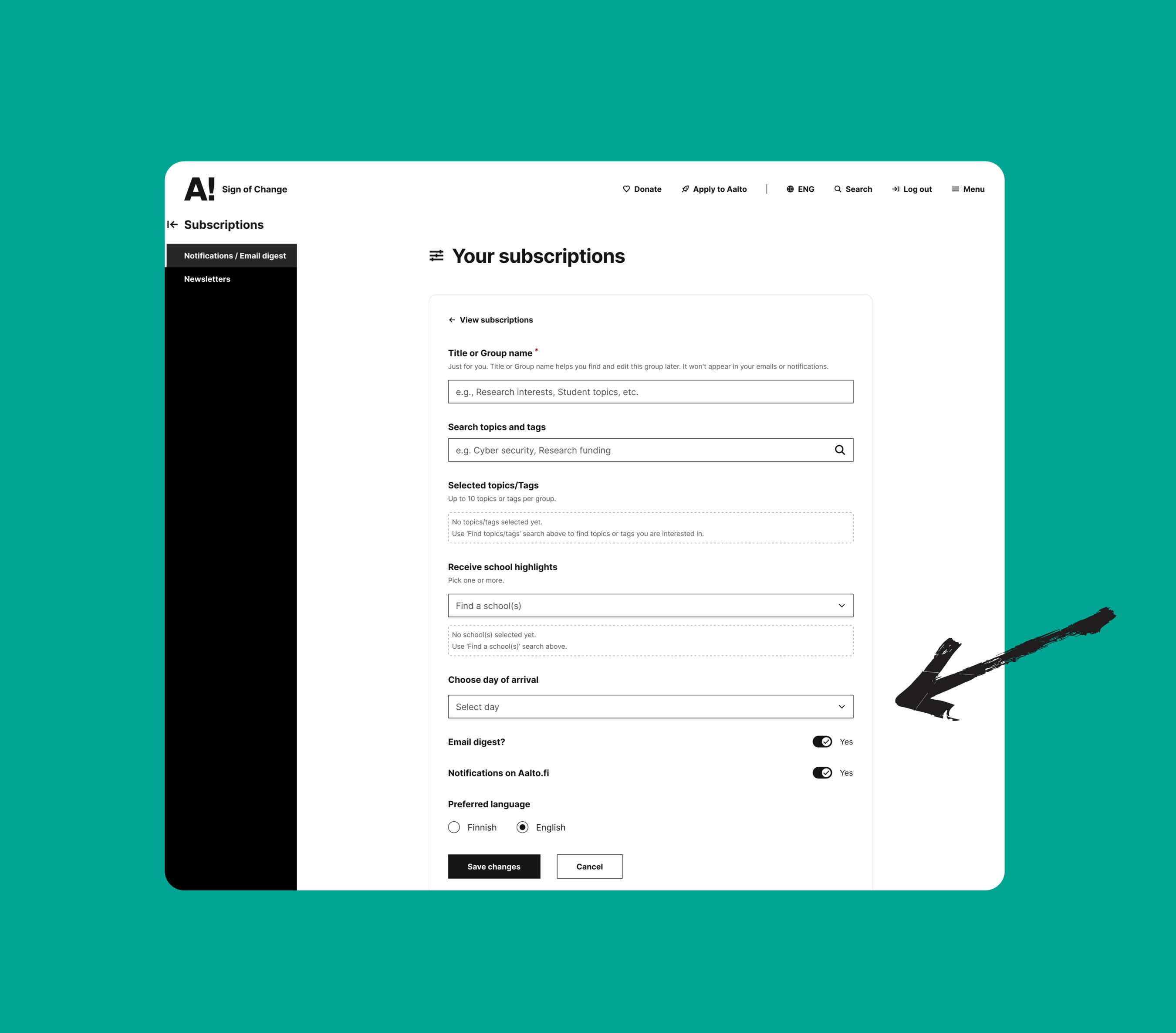
One insight shaped almost every downstream decision: people didn't just want relevant content; they wanted it on their own terms. Several interviewees specifically mentioned wanting their newsletters to land on Friday mornings or over the weekend, frustrated that updates kept arriving at the wrong moment, buried under everything else in their inbox. That reframed the problem from "what should we send" to "when do people actually want to receive it," and became the core design principle behind the system.I designed a subscription center around a simple side-navigation interface. Users can build up to six subscriptions, each pulled from Aalto's existing tags, so there was no new taxonomy to learn or maintain. They choose their own delivery timing per subscription and receive updates in two ways: a personalized email through Salesforce Marketing Cloud, and an in-context notification, which is a small indicator in the top right of Aalto's main site. The design was prototyped and retested with the same people who'd been interviewed, closing the loop between what they'd asked for and what they were actually getting.
Challenges
Two points of friction shaped the project in ways I hadn't anticipated. Early on, we needed real alignment with developers on exactly how the Aalto tags should function within the system. This conversation took longer than expected and delayed initial progress until we got it right. Separately, school communications staff pushed back in workshops, not out of resistance, but because they wanted more control over their own tagging rather than being limited to a fixed set. That feedback didn't get shelved; it became a second-phase feature, letting individual schools define and push their own custom tags.
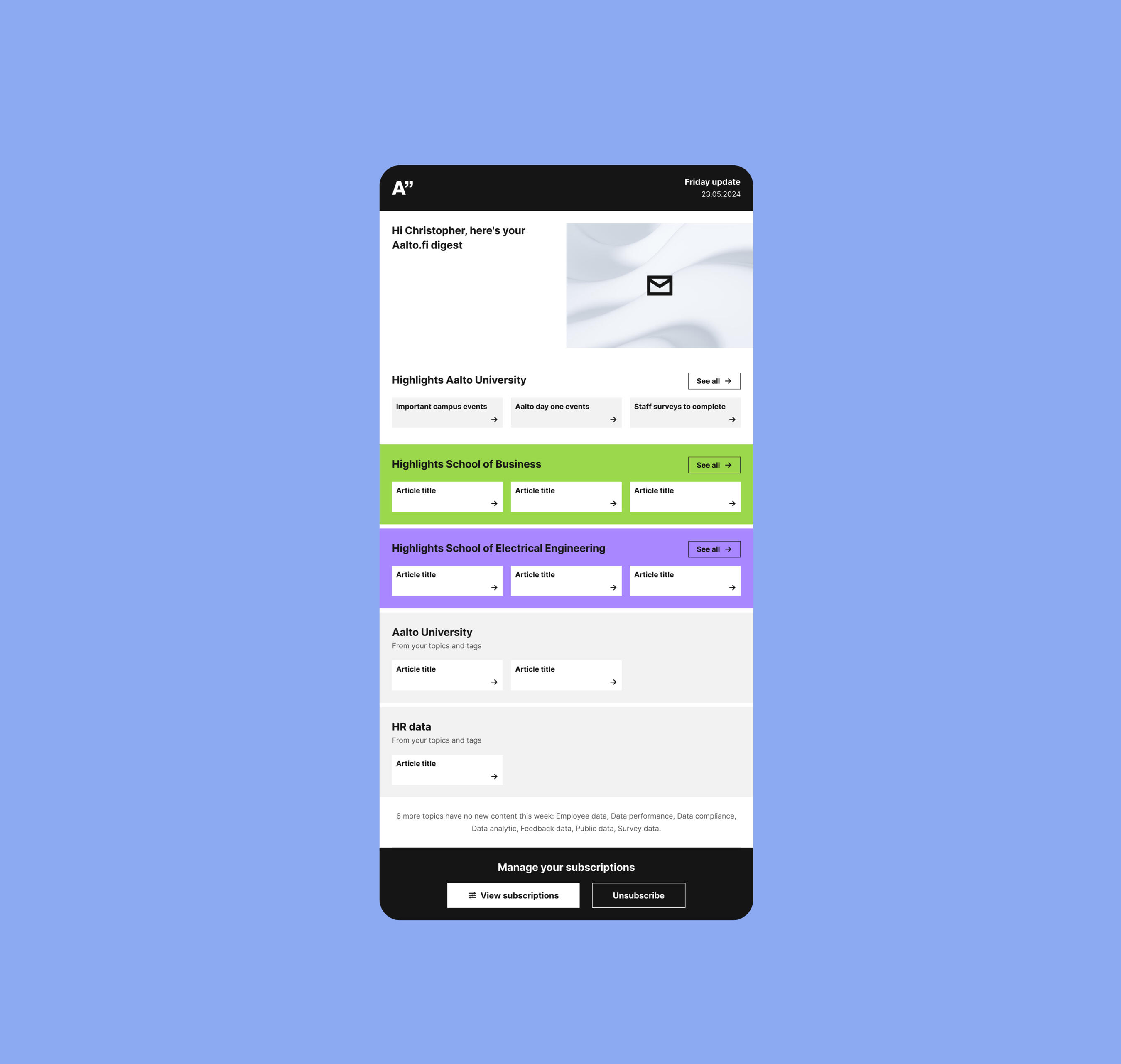
Results & Next Steps
Usability testing surfaced something I hadn't expected: people were conflating "subscription" with "newsletter" itself, treating the two as interchangeable even though the system worked differently under the hood. I reframed the interface's language until that distinction was unambiguous. Beyond the interface fixes, the workshops themselves told their own story; stakeholders weren't just tolerating the idea, they were genuinely eager to adopt it. The project is heading into launch now, and I'll be updating this case study with real adoption data once it's live.
Phase two extends the system to prospective students and rolls out the custom school-tag feature.
Once live, I'll track adoption against the original newsletter engagement data as a baseline.